Finalizing the demo
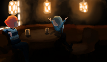
(I just fucked up and accidentally reloaded the page when I was writing, so everything was undone, so I'm kind of pissed as I am writing this)
BIG THING: The game is changing name. "The nordic winter" is very unoriginal and it was impossible to find it in google searches. "Nordic Niefel" on the other hand is a different thing. It is no products or games with the name, so if people google "Nordic Niefel" then I can be shure that they find the game. It was the same thing for my name. My old name was "Stellar Sky Games" and it was really difficult to find if you googled it. So I changed my name, and now it is the first thing you find when you search "Hizuvi". There are two reasons for this. One I came up with the name in a really wierd way (thats a story for another time), and two, I googled for the name to see if something relevant came up.
Small thing: since I am so late to this devlog I will just move the whole thing a week forward. So there will be no update next week, but there will be one in two weeks.
REMAKING THE UI:
I remade the UI during this (extended) cycle, and it doesn't look like something a five-yearold has thrown together anymore. As an extra thing, the new UI has a quit button. Not having a quitbutton is a habit of mine. It is just easier to make the game quit when you press escape and done instead of creating a button for it, designing the button, making the button do what it is supposed to. It usually doesn't. Buttons have such bad manners (or I am just really good at messing up code, who knows). The code for making the game shutdown is really boring as well (and short, so it shouldn't be possible to mess up. But I do anyways). But now, let me show off the differece for you. Here is the old main menu and the new one side by side:
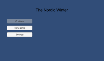

Pretty big difference, right? The new one is just so much more in sync with the game, while the other one is something you could throw together in a gamejam. Here is the gui for the pausmenu (which the game has now, always good to have ya know):
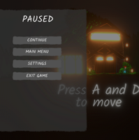
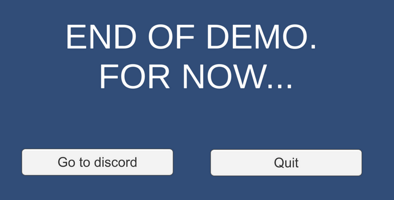
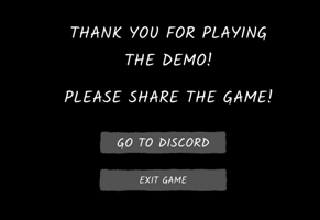
Now, for the most important piece of UI in the demo; the final screen. Here I want you to join the discordserver (and to where you should wishlist the game when it gets onto steam). Compare the different versions and think about which "Go to discord" button would you rather press?
MAKING THE MUSIC:
Music is, together with the art the thing that will make the game stand out. I take a lot of inspiration from Undertale, Disasterpiece, Celeste and Porter Robinsson, and I hope it shows. I try to make intersting melodies like in Undertale, and make the melodies and motifs evolve along the way. I take the "get the player into the flow" mindset from Celeste, and taking the musical moments in Celesta and Undertale. From Disasterpiece I take a bunch of reverb, and the slow and atmospheric nature of his songs. And last, but not least, I a lot of things from Porters songs, but primarily the "being special" part. Everything I do I should do with a purpose, and it should be special. It can be something small, or it can be focusing on a single thing, but there is always something making Porters songs special.
Let me show you all of this in the track "Friends"
The song starts with showing the lightmotif that represents Molly's and Victoria's friendship. Thats the melody part.
Then the special part comes in; the song switches to 6/8 instead from 4/4. Over that switch there is an augmented (the same notes but stretched to be be longer) version of the same lightmotif as in the beginning.
The to be able to loop seamlessly back I have a part in the end that makes your brain switch from 6/8 to 4/4 again.
FINISHING THE CUTSCENE IMAGES:
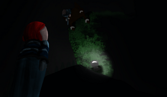
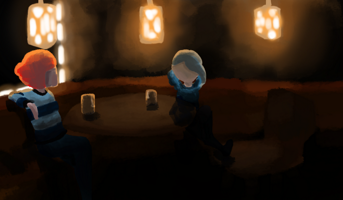
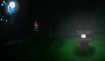
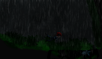
Let me talk about the images that are displayed during the cutscenes. The cutscene with least images have 6 and the one with most have 21, and there is a fair bit of images. I think there is a about 60 of them, and everyone of them are painted by yours truly. So it took a fair bit of time. Thats where most of the time of this cycle went, just trying to finish all of the art. But I shouldn't speak about it, I should just show you some of the pieces, so here you go:


KEEPING THE SIZE OF THE BUILD DOWN:
A bit about something people don't talk about that often in gamedev, but an important thing for me is to keep the size of the game pretty small. It is still over 150 MB and I think that is a bit much, but it is a lot of art in the game, so I hope it is understandable. Now if you have been paying close attention, you might have seen that this build is actually smaller than the last one. You might ask how? Did I remove things. Nope. Were I smart and knew I shouldn't have images ten times the resolution they need. Nope. So what did I do? I looked up a tutorial and then made the game get smaller. (Fun fact, the first verions was 300 megabytes, because I had animations that were on a tiny part of the screen in full hd resolution. It was really nice when I could cut off those 120 or something megabytes just by lowering the image resolution)
This is somewhat an heartfelt thing for me. I have a pretty bad internet connection (1mb / second at my room), and downloading a game on 3gb is a pretty big thing to do. And I know people have a lot worse connections than me, so thats why keeping the size of the game down is important for me. It is about enabling more people to play the demo, which is important for me. Not just from a marketing view but also from a very personal view. The main reason that I create games are that they are experiences, I want to tell people something with them, or entertain them. For me, that is what gamedevelopement is all about. Creating something others are able to enjoy, and I find incredible enjoyment when I see that people like what I do, and I see that I can make a change.
From a marketing standpoint it is also so much better to have a demo that is quick to download and play. It is about lowering the efforts the players have to do to play the game, and in the extention that will make more players play the game and (hopefully) wishlist it on steam when it gets out. And maybe even buy it. That would be something XD. It is the same reason I made the webgl version. It makes it easier for the players to go from being a viewer to a player. And that is important.
BONUS THING:
If you have dyslexia there is a checkbox called "dyslexia font in dialogue". You can find it under setting/accesibility in the game. Please tell me if it helps or if it is useless. Feedback is always great!
Files
Get Nordic Niefel
Nordic Niefel
Save your friend and unite the worlds in a beatiful world filled with amazing sounds!
| Status | Canceled |
| Author | Wistpotion |
| Genre | Platformer |
| Languages | English |
More posts
- Eherm, I'm up to stuffAug 07, 2021
- I might be gone for a whileJun 09, 2020
- The art of quickly throwing things together!May 25, 2020
- (Unity tutorial) OnValidate is my babe. How to use Unitys functions and gizmos t...May 24, 2020
- This is how it should look!Apr 20, 2020
- LIGHTING IS AMAZING. And kind off a mess... and sprites are as well...Apr 06, 2020
- Prototyping the tutorial and adding more animationsMar 23, 2020
- I finally did somethingMar 09, 2020
Leave a comment
Log in with itch.io to leave a comment.