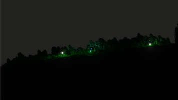
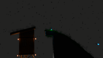
LIGHTING IS AMAZING. And kind off a mess... and sprites are as well...


I have a lot to talk about for this devlog, so here we go. (Also, if you are afraid of walls of text then it's time to flee for your life)
In the start of these two last weeks I had a moment when I ended up just sitting and admiring the lighting. That is how I really wanted the game to look and feel. It just looked so saturated and full of life. It took shitloads of time to get the bloom looking just like I want it to (and it took a fair bit more time to fix all of the flickering and stuff that you get with it, it's only kind of done right now) and making it work in all places that required it, so I'm super happy with the outcome!

(This next paragraph was written during the developement, so if it messy I'm sorry. Actually I'm not, meheheh)
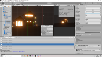
I have a ground sprite, and on it there is a sprite serving as an outline, and that outline sprite has a normalmap, thats use to be kind of a bumpmap for 2d objects. I wanted to have sort of an edge on the ground sprite so that it would be more clear that it is ground. So I added the normalmap but the normalmap just made the outline darker, when what it should have done was to make the sprite lighter. I tried inverting the normalmap, but nope, still the same issue. It was a bit wierd, considering the ground sprite still was lit up, and it was lit up more than the outline. Now, I started messing around with the lights to see if I had messed something up and on the lights I'm using there is a property called "Distance". I tried messing around with the distance, and when I set the distance to something low like 0.1 it looked right, but when set to something like 1 it was just wrong. Then I figured it out. THE LIGHTS ARE BASICLY PLACED IN 3D SPACE! I was completely blown away by it. The renderer actually accounts for a z axis when calculating lighting with normals. So if the light has a higher distance the places where the normalmaps tilt more is lit up less because the tilting part begins to actually tilt away from the light. Well anyways, thats the stuff that I find interesting. Pfft, who would get amazed by the greatness by the 3d rendering capabilities of unity when you can get amazed by NORMALMAPS. (Nowtime Hizuvi is back now, and just for the sake of it I'll tell you i had to remove the edge because issues with it. So, I have had fun times!)
I have worked my butt off trying to get all of the sprites ready to be placed in the world. And that was what I were hoping to be spending most of my time on for this cycle (I'll just write cycle instead of "these last two weeks", it's easier). But, you know, thats not how it went. I have spent most of my time messing around with the code and trying to get the lighting to look right. The bloom was the hardest part of it all. It was just so difficult to get right. I created the bloom using shadergraph and copied it from the tutorial brackeys made about 2d lights. You could check it out for some context. So anyways, I followed the tutorial. In the tutorial he uses an unlit sprite, but I wanted to use a lit. So I did that and soom I had a pretty nice looking light. Then I duplicated it and everything went apeshit. The bloom in URP works so that if a pixel exceeds a value then it blooms. If you have a lightsource then that will make pixels brighter around it, but that is not a problem if the sprite with bloom is unlit. If it is then it, um, yeah, I think you can figure it out for yourself. It got a bit too bright, so to speak. But I figured out a way to fix that involving 2 days of me almost screaming in frustration from trying to google up how to get data from lights to shadergraph. Fun fact, for 2D URP there is ABSOLUTELY NO WAY to get the 2d light data. Please tell me I'm wrong here.
After I had dealed with that I could finally see without my eyes wanting to flee I moved on to adding loads of stuff to the tutorial level. Although right now I have a lot of stuff left before It is finished. I'm running a fair bit behind of my original schedule, but I think the speed will pick up now, becuase I figured out how to use all of the tools that I have at my disposal and I mostly have to just create sprites and do worldbuilding now! I have some programming to do for the enemies, but that will be much more fun that than trying to make sense of the really overcomplex code in the URP scripts (They are optimized really well and stuff, but it is not at all easy to read), and so much quicker to do. At least I'm saying it will be faster to write that the other things I have written. I feel like I have said that a few times by now. I never learn my lessons, do I?
Now I want to talk about Editor tools. If I had realized how useful they are two months ago I had gotten a fair bit further on the game. For example, for most of my sprites I have a normalmap and for some I have an emissionmap. It isn't that bad to add those manually to ten sprites, but when it gets more it's very repetitive(and when the game is done I might have over a thousand). So first I used a macro to do it for me, and it was way faster than doing it manually. It worked for a while but it was still pretty slow. So when I wanted to add a lot more sprites to my animations for the playercharacter it was just too slow to add them with the autoclicker. So I did what every gamedeveloper would do and went online to check for someone who had made a script for it. And there was one, and it wasn't even that complicated (even though that it was more complicated than any editorscript I have ever written, I'm really bad at writing them). So when I later wanted to select a load of sprites and change the sortingLayer for them without having to select all of the sprites manually I wrote an editorscript for it, using the code for the textureadder as a base. And it worked so smoothly. So I will definetily use more editorscripts in the future so I save some time when doing repetitive things. Also writing an editorscript is way more fun than selecting a few hundred sprites and changing the material.
I wrote last time about how I had slacked off in the beginning of that cycle, but this time I managed to minimize it, and I worked a lot more during the first week than I did last cycle! So the tricks I mentioned worked!
And for finishing this rambeling up, I would like to have your opinion on the tone of the game, and give me some inspiration for it. So if you have found art or music in a similar style to the game or something that just looks good or sounds good, send them here so I can have a look at them!
Ps. Also there might be an update coming sooner than in two weeks with the tutorial finished)
PsPs. If you play the game I would be so thankful if you could record it and send a link to the video so I can look at how you play. It's just really helpful for me to understand how people are playing the game. You don't have to, but I would just appreciate it a ton!
Files
Get Nordic Niefel
Nordic Niefel
Save your friend and unite the worlds in a beatiful world filled with amazing sounds!
| Status | Canceled |
| Author | Wistpotion |
| Genre | Platformer |
| Languages | English |
More posts
- Eherm, I'm up to stuffAug 07, 2021
- I might be gone for a whileJun 09, 2020
- The art of quickly throwing things together!May 25, 2020
- (Unity tutorial) OnValidate is my babe. How to use Unitys functions and gizmos t...May 24, 2020
- Finalizing the demoMay 11, 2020
- This is how it should look!Apr 20, 2020
- Prototyping the tutorial and adding more animationsMar 23, 2020
- I finally did somethingMar 09, 2020
Leave a comment
Log in with itch.io to leave a comment.